In the chaos of superpowered individuals, many authors’ storytelling device is how those blessed with powers relate with normal people. From Doctor Manhattan, Superman to the Dream of the Endless, why does detachment come to those with the power of gods?
Niteside and the Rock #2 is a solid story about two people slowly forgetting their humanity. As they become comfortable with their lot in life, they start departing out of the way. It is a deep story meshed under several layers of Bodine Amerikah eccentricity, just the way he would do it.
The Story and Writing of Niteside and The Rock: Tasteful Indifference
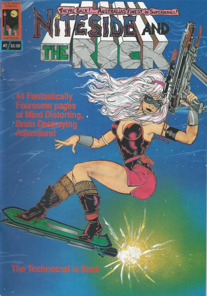
Niteside and the Rock #2 is an Australian indie comic book published by Fly By Night Graphics. The comic book is written and drawn by Bodine Amerikah, now known as Bo Jardine.
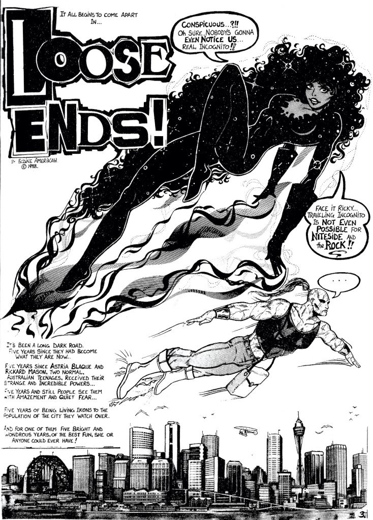
The story follows Astria Blaque, known as Niteside and her lover and partner, Rickard Mason, known as The Rock. The story starts five years after they discovered their powers, eventually learning everything there is about them.
They have also become the darlings of the local people, famed for their powers. Niteside is especially loved by the people for her ability to fly and her beauty. Even then, both characters are starting to drift away from each other.
Niteside is starting to notice how Ricky started becoming cold and distant since they had their powers. The Rock also notices how Astria is growing detached from normal humans, stopping to care about anyone other than herself.
The writing of Niteside and the Rock feels similar to The Watchmen in style and scope. It feels as gritty and dark, which is awesome for an 80s comic book. Both our heroes remind me of Dr. Manhattan as he slowly drifts away from his human emotions.
Even as Jon Osterman, Dr. Manhattan cared more for his work. As he became the only superpowered being in his universe, he started to see humans as small and insignificant in the grand scheme of things. It seems Niteside and the Rock are on the same path.
Both characters are selfish creatures in their own way. Niteside has always cared only for herself and Ricky, a mark of her rebellious attitude. The Rock, since his transformation, cared too much about becoming a good hero to fill his personal inadequacies.
Both characters are complex, much like what anyone can expect from Bo Jardine creations. Whilst I’ve only ever seen this series from Bo, the way he weaves his stories are reminiscent of Tim Burton.
Bo knows how to create stories that are simple and yet dark and macabre. His storytelling, especially for this issue, is both moody and powerful. His characters are fully grown and complete, so I wonder where the story goes in issue 3.
The Art of Niteside and Rock #2: Pure 80s Goodness

The art of Niteside and Rock offers a good, deep look at how colour should never be an issue when drawing superb art. Bo outdid himself with Issue 2, showing his unparalleled pencilling and inking skills.
For its time, it’s hard to understand how Bo made his pages this clean and beautiful. Every panel is nicely drawn, with clean outlines on where the characters start and where the background ends. The title splash is especially lustrous, with the gorgeous Niteside flying with all her dark glory.
Every panel shows its intentions clearly and they work. The character designs are better than ever too, and it’s easy to see how comfortable Bo is with drawing women. His style of drawing females remind me of how Don Heck did his art during X-Men’s golden years.
His design of The Rock is not too shabby either, showing a superbly craggy tower of a man. His background art is as professional as it gets - even better than many classic stories I’ve seen that came out for this time.
What strikes me the most with Niteside and Rock, weirdly enough, is his lettering style. Whilst I generally don’t care much about lettering, his title card is awesome. Its use of the ransom note font works nicely in the grand scheme of the entire story.
The handmade lettering also has a tinge of amateur work but in a good way. It feels like I’m reading the comic book pre-publication, which is something to love.
Rating: 4.8/5
« PREVIOUS NEXT »
Jerome
Jerome is the nerd you're looking for - loves comic books, video games, and all things tech. He writes and does digital marketing on the side, apart from being a full-time dog dad of two hyperactive pooches.