In many stories, some heroes stumble into adventure. They are those people who push on headlong, consistently carving through their path. It seems Toby is the second type: the one where the adventure stumbles upon our hero.
Toby and the Magic Pencil #2 is an enjoyable knockabout story that tries to do a lot of things at the same time. It also forgot how everything should go, leading to an end that felt like a contrivance that had the chance to end strong and yet felt incomplete.
The Story and Writing of Toby and the Magic Pencil #2: It Didn’t Work

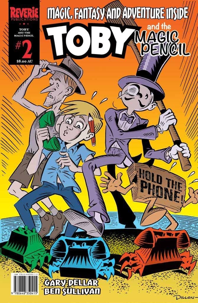
Toby and the Magic Pencil #2 is an Australian comic book published by Reverie Publications. The story is written by Gary Dellar, with art from Ben Sullivan and lettering from Darren Close.
The story of Toby #2 closely follows the previous chapter, as the titular character tracks his lost brother, Gareth, and evade Sid, his dragon creation. As he moves about, he and his comrades wash to the island, only for the soldiers to catch them.
Toby #2 is a mixed bag of good things and weird things. On the surface, it’s a nice story with strong lore and proper world-building. Plot progression and pacing moves without fail, and the plot is airtight. That’s as far as I go, however.
So far, the story has come all around. The story moves for the sake of moving, and Toby is stumbling upon the adventure. He’s not dictating the story’s pace by having clear direction, but rather moves where the tide takes him.
Every character is weird. They don’t have consistent personalities throughout, changing at random to fit the story. I likely don’t understand the story at all. The telephone crabs, the mormons, and even the whales felt out of place.
Maybe I’m grasping at straws, or I’m missing something. It’s likely that I would need Issue #3 to understand what’s being built in here. Whatever the reason is, I felt that the ending suffered.
I’ve seen other people gush over the story, and I’m not sure what’s my problem so far. It doesn’t seem fair, but I would want to read the complete the entire series to get the full picture.
The Art of Toby and the Magic Pencil #2: TinTin All Over

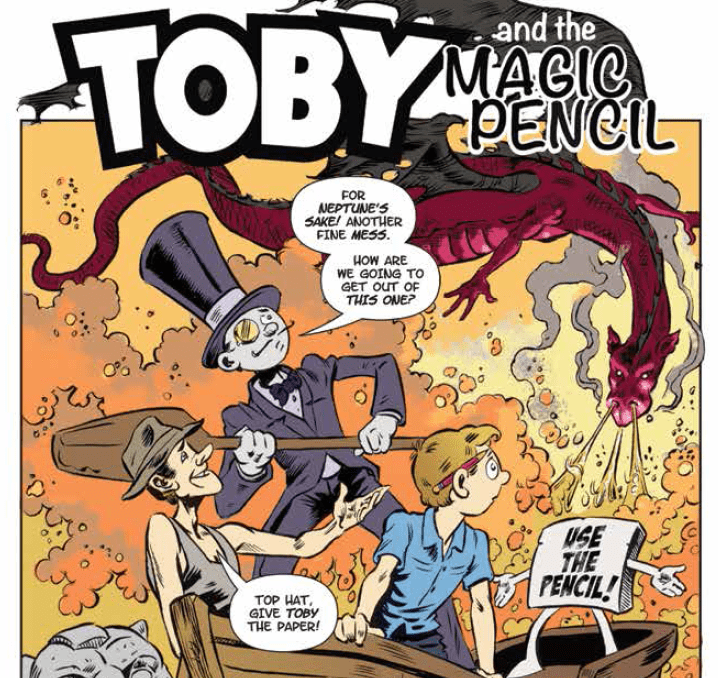
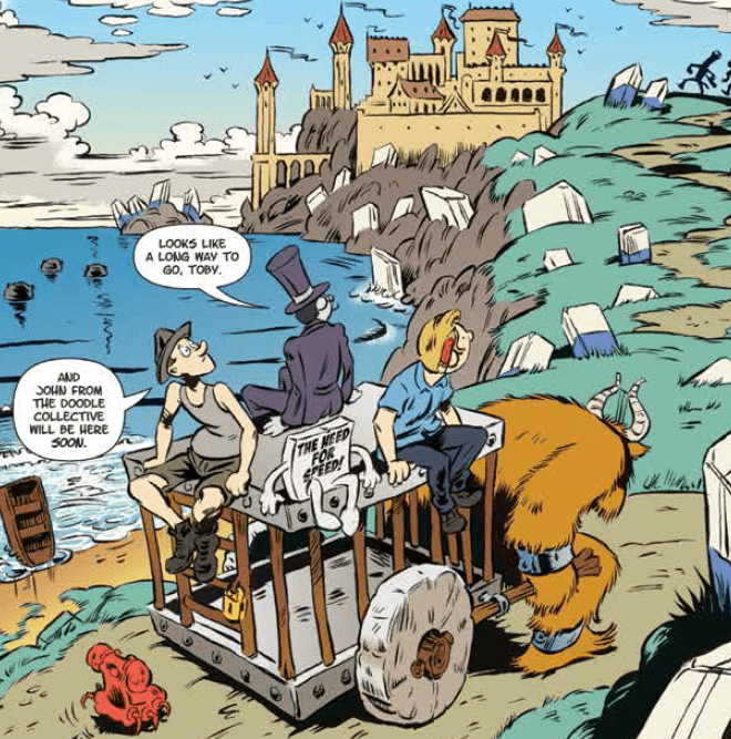
What Toby and the Magic Pencil #2 lacks in a coherent story for me, it makes it up for a better art design. The difference between Dillon Naylor and Ben Sullivan’s art comes from how they treat their character design. Both offer something unique in their own right.
Dillon uses angular outlines to create a modern take on the comic strip style. His inking style creates a faux-50s comic strip but still felt new. Ben’s art moves closer to the time period, with softer lines and more rounded, realistic design.
In fact, it feels like Ben went all-in on the TinTin feel. The art, colours, and outline feel straight out of Herge’s pages, specifically TinTin and the Picaros. It’s a great style that lends nicely to the feel that the comic tries to evoke.
There isn’t much complexity to the paneling but everything is consistent and made sense. I love it.
Should you Read Toby and the Magic Pencil #2?
Should you read Toby and the Magic Pencil #2? Yes, even with all that I’ve said, the story is still quite entertaining. I also suggest readers to go in with their own look at the comics. Whilst it may have barely worked for me, it should have different results for others.
Toby is a great adventure that needs a steadier direction. I’m still looking forward to seeing Toby #3.
