It’s hard to be a supervillain, and nobody knows that more than the B-villains with low-quality superpowers. Crimson and Rascal #2 tries to foray into the classic betrayal trope, trying to recreate what’s basically a parody of The Dark Knight Returns.
Compared to Chapter 1, this chapter is a funnier. The art is still impeccable, with Peter Wilson providing colours to the art now. It’s a good deadpan parody whilst sticking with its guns.
Retail Detail: The Story of Crimson and Rascal #2

Crimson and Rascal #2, titled Rascal’s Retail Wrath, is written and drawn by Peter Wilson. He also provided for the inks, colours, and likely cover art too. The entire story is a 14-page spread, with ten pages of story.
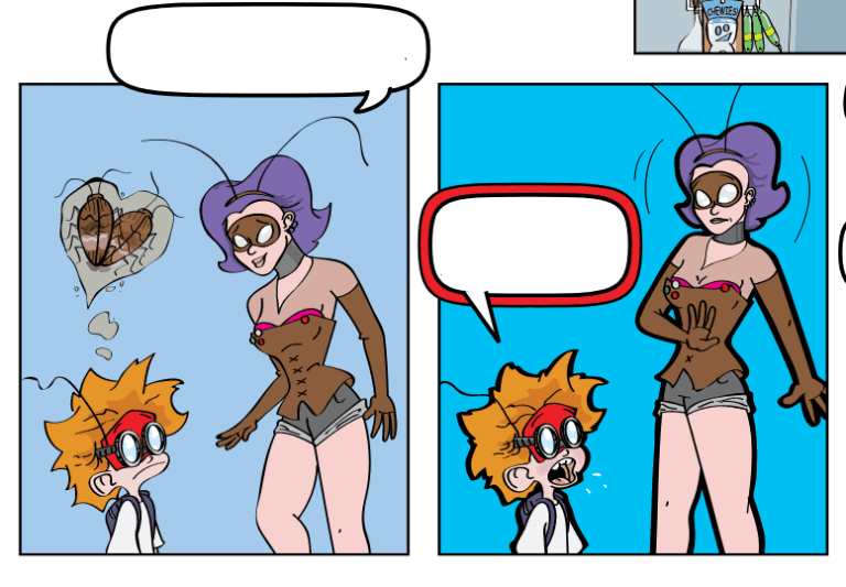
The story still follows the dysfunctional duo of Crimson Crusader and Red Rascal, who are doing their weekly shopping. A B-level villain, Roach Girl, tries to ambush the duo, only for Crimson to brush her off.
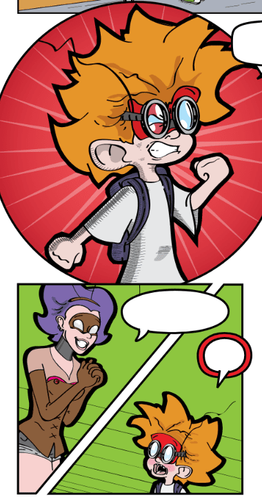
Rascal, however, gets a crush on Roach Girl and becomes smitten with the lass. As Roach Girl tries to anger Crimson, he still brushes him off. Rascal, tired of being treated like a kid and still crushing on Roach Girl, is coaxed into betraying Crimson.
Consistently Funny: The Writing of Rascal’s Retail Wrath

The writing for Crimson and Rascal #2 has improved a lot compared to the first issue. The comic book still operates like the ‘90s to early 2000s Nickelodeon cartoon, which works this time.
The plot progression for this specific chapter is clean, with a good direction throughout. The characterisation for all characters is consistent from start to finish, and there were a few laughs to be had.
For starters, Roach Girl had quite the chemistry with both protagonists. She’s neither annoying nor forgettable, even with her failed attempts to fight and seduce Crimson.
Crimson is in his usual knucklehead self, reminiscent of the buffoonery of The Tick. Even then, he goes out of his way to keep the story as linear as it can be, which is funny in its own way.
Rascal, on the other hand, is admittedly cute. Children get their crushes all the time, and it’s funny to see a young child enjoy himself in the process. The villains play with it too, which is very sweet of them to do.
Professor Viridian has a nice backstory and is hilarious in his over the top villainy. The interactions between all characters is cartoony too, which is quite good for a superhero parody story.
Peter Wilson’s Masterclass In Comic Book Art: The Art of Crimson and Rascal #2
Much like the first issue, Peter Wilson delivers straight and hard with his fantastic art. The comics is a good example of how to produce topnotch comic book art even if you’re a solo auteur.
The character designs from start to finish are consistent. Every character looks alive and breathing, with palpable motion in every panel. The background designs are also clean, relevant, and quite cartoony.
In general, the art looks like it came from a full art team for full trade paperback comic books. It’s even much better now in full colour, making the comic book more alive.
The design output is crisp. The panelling varies, with different pacing with every scene. They also enhance every situation and they’re cool to read. The inking also enhances the look between the foreground and background.
Foreground characters have proper emphasis, whilst the backgrounds are vivid even when out of focus. Page 7, in particular, is a great example of how to do stellar characterisation and motion lines. Wilson can use this page as a masterclass on how to tell more with less.
Should You Read Crimson And Rascal #2?
Should you read Crimson and Rascal #2? The answer is a resounding yes, you should read it. It’s a vast improvement from CaR #2 and is quite a funny, entertaining read. It’s a little short, but that doesn’t deter from being a barrel of laughs. If Crimson and Rascal Chapter 2 is anything to go by, I’m looking forward to more things that Peter Wilson will do in the near future. His art is impeccable, and it’s always a joy to read something similar to CaR #2.
